Friday, September 17, 2010

Sepia pictures found online:
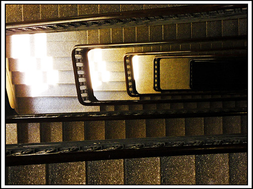
http://eyeofthemoment.artspan.com/show-image/498664/Eye-of-the-Moment/forum-lines-looking-down-sepia.jpg
http://farm3.static.flickr.com/2306/2495823432_a9bdb810e8.jpg

http://fineartamerica.com/images-medium/sepia-window-sue-fulton.jpg

http://beetle-blog.com/photos/wp-content/uploads/2008/10/sepia-2.jpg
A good sepia print has an interesting subject and has a warm mood to it. I think I am going to use plants or a person as my subject. I think both subjects have the ability of giving a warm, happy mood so would make a good sepia print.
*For my sepia pictures I took a picture of shoes in a reflected dresser and a piano with reflections. I like how the pictures were soft and did have a warm mood to them instead of taking pictures of rain or someone mad. I could have spent more time on them and dodged and burned better but they came out alright. I wish I had more time to really think about the subjects of my photos and had something no one else would have thought of instead of a boring piano which has been photographed a million times before.
Hand coloring found online:
http://www.google.com/imgres?imgurl=http://www.dareland.com/emulsionalproblems/LAsky2.jpg&imgrefurl=http://www.dareland.com/emulsionalproblems/handcolored.htm&usg=__MUlAJJcCd6_ZJ9eT3DZceGzkI7Y=&h=751&w=562&sz=51&hl=en&start=44&zoom=1&um=1&itbs=1&tbnid=Xp_28MDvgsTrRM:&tbnh=141&tbnw=106&prev=/images%3Fq%3Dhand%2Bcolored%2Bphotos%26start%3D40%26um%3D1%26hl%3Den%26sa%3DN%26ndsp%3D20%26tbs%3Disch:1

http://www.google.com/imgres?imgurl=http://www.dareland.com/emulsionalproblems/LAsky2.jpg&imgrefurl=http://www.dareland.com/emulsionalproblems/handcolored.htm&usg=__MUlAJJcCd6_ZJ9eT3DZceGzkI7Y=&h=751&w=562&sz=51&hl=en&start=44&zoom=1&um=1&itbs=1&tbnid=Xp_28MDvgsTrRM:&tbnh=141&tbnw=106&prev=/images%3Fq%3Dhand%2Bcolored%2Bphotos%26start%3D40%26um%3D1%26hl%3Den%26sa%3DN%26ndsp%3D20%26tbs%3Disch:1


*For hand coloring I took pictures of a plant and the sunset. Instead of coloring in just pieces like I intended to do I ended up coloring the whole picture. I am not a huge fan of hand coloring and I'm also very impatient so I was not happy with how the final picture came out. I should have used more colors and it probably would have been better if I had just colored in pieces.
Cross- processing found online:
http://abduzeedo.com/files/imagecache/img690x320/originals/cross.jpg

http://larsleber.com/blogsites/larsleber/photos/germany/berlin2008/IMG_6516_800.jpg


http://farm1.static.flickr.com/64/195224893_b950deb00d_z.jpg?zz=1


Cross processing is developing film in a developer meant for a different kind of film. Bright colors make a good cross-processed picture.
*My cross processed pictures came out really red this year and last year they were really green. I love how this developing technique is always surprising and I was happy with my pictures. I took a picture of my dog behind glass and a plant that came out very red. I love the coloring of cross processed pictures.
Solarization found online:
http://theskateboardmag.com/content/blogs/jgb/gatorvuko-1982-solarized.jpg

http://farm1.static.flickr.com/114/309704678_143edba707.jpg


http://media.photobucket.com/image/solarization%20photos/arodgers15/img012.jpg


I think a lot of curvy lines make for a good solarized picture. I want to use people as my subject.
*It is important to keep solarized pictures simple because it is hard to see detail in them. My solarized pictures were of a moth and a concrete wall and splintered wood. The moth picture was pretty gray but I liked how it came out. The splintered wood I did not liked because it was very hard to tell what it was but it came out very solarized.
Polaroid transfers found online:
http://d3b9cwalzc5eko.cloudfront.net/stock-images-polaroid-transfer-technique-background-pixmac-451203.jpg
I like the colors in the picture shown below.
These pictures are all of water but I like how each one has a different color.
http://www.nanmelville.com/nm/wp-content/uploads/2010/01/water_fw.jpg


http://www.corbisimages.com/images/67/416FC96D-C384-48B3-839C-4653091EBD2A/AABX001003.jpg
I like the subject and the graininess.


For the picture above I love the colors and how the image is out of focus.

A good polaroid transfer has unique and interesting colors - it doesn't look perfect and each one looks different. I am going to try and capture cool colors and maybe make my subject out of focus so the picture captures the attention of the colors more.
My polaroid pictures were of a flower by a tunnel and the sillouette of my friend's hand holding a leaf with the sky in the background. I loved the color of the hand polaroid even if the position of the subject was awkward. The other photo did not transfer as well and I could have redone it but I didn't want to waste paper so I kept it.
layers in photography found online:
http://www.tipsfromthetopfloor.com/wp-content/notlongnow.jpg
This photo above has 4 layers the boxes, the ladder, the box, and the wall.I like the lighting and position of the objects in this photo. No layers intersect. This assignment will help me as a photographer notice layers more.


This photo has grass, trees, mountains, more mountains, clouds, and sky.


http://farm4.static.flickr.com/3198/2788810586_69b022430c.jpg

This photo has the layers of each descending step and the lighting really helps make this picture amazing.


http://emmas.blogg.se/images/2008/aw08_1_pg10_15571241.jpg

This photo has the lady, the shelf, the cups, and the tile wall. The window's lighting makes it a powerful picture and the natural stature of the woman.
Being able to spot layers in photography is a good skill to have because the more layers, the more interesting the photograph is. My layered pictures were of a leaf in a pond and I used the leaf, the water, the shadows, and the reflection then sky as the layers. I didn't really enjoy this photo personally I thought it was boring and the layers were very vague. My other layered picture was too literal it was a frame, a mirror, relfection in the mirror, trees, then the sky as the layers. I could have developed the picture better and I thought it was not a creative picture.

Thursday, September 16, 2010

3200 film photos found online:

https://blogger.googleusercontent.com/img/b/R29vZ2xl/AVvXsEiOd9QpJmjthmlzElsn3NOnxU_mjRVZvRK-e8BB6c9H66JMEBoU1DlEODTYaSiZ246FDxVEYk9GKsrRzCj2osOOn8aetvgZrilSG-hK7H4wAh4aEfIErNP71mFgsbenuf0PWx_v1B61qWU/s400/hanging_ipod.jpg
https://blogger.googleusercontent.com/img/b/R29vZ2xl/AVvXsEggk8g0iSDrbIZ87aTMXahYqKEFL4nWftkHwQ-b2dCrqdPai6UemGO7zK59VnNezZlCLAkiLA8E1TyUSrxKXTil53p0C4HMv9fZKdRrmchRZNVMpml1wo12HA_iE68o-R1vbw25dWwJH6z_/s400/Anna+Portfolio-33.jpg


I like these photos because they are different and creative - I can tell thought was put into them. They have a lot of grain and I like they way it looks in higher film speed. It gives the photos more drama and mystery. I tried to use low lighting for my roll but sometimes I used outside lighting as well. I was happy with my photos but it was harder to print a picture in the darkroom using the new film. Next time I will use more dramatic lighting for 3200 film speed. I used 3200 ISO when I shot my photos- it was the highest ISO on my camera. The advantages of using this film is it has more flexibility when it comes to lighting, it can be shot outside or in very low light situations.
My first roll of film is boring and uncreative- I wish I took the majority of it outside of school. The subject of my first 2 photos is a door with paint peeling and a plant in the garden by our school. I don't really like my first 2 photos they are too dark. I could improve developing the picture in the darkroom- I get very impatient with the enlarger. I'm not comfortable using dodging and burning.